
More Layouts
RelativeLayout works pretty much like FloatLayout and the difference will be clear only later when we embed it in another layout. Here’s a simple example with a RelativeLayout and just one button in it. The button should be positioned at the fixed coordinates 0, 0 and occupy about a third of the available space in both horizontal and vertical direction.
Here’s the Python code:
| |
And here’s the kv file:
# File name: helloworld.kv

<RelativeLayout>:
    Button:
        text: 'Button'
        size_hint: .3, .3
pos: 0, 0 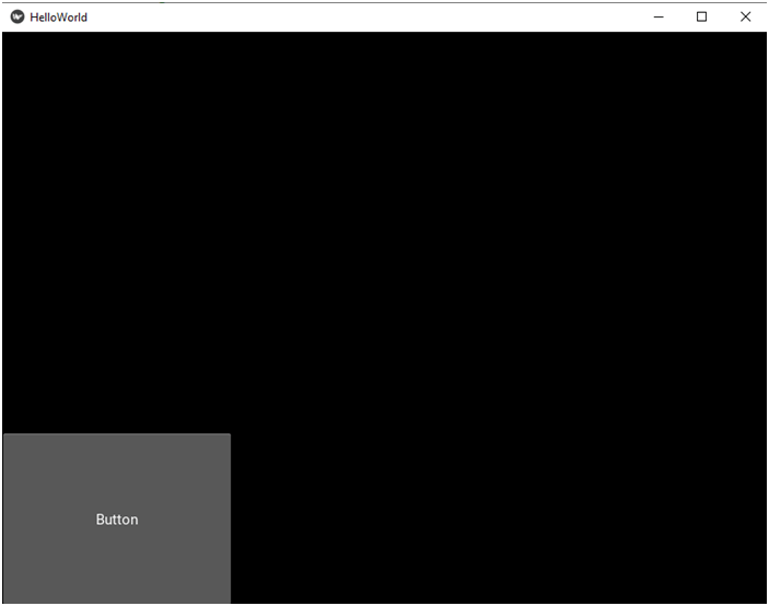
So, what’s the difference? As mentioned before, you will see the difference soon. And now let’s move on to the next layout, the GridLayout.
To demonstrate how a GridLayout works we’ll need more than one widget in it. Let’s create five buttons this time. Here the Python code:
import kivy
from kivy.app import App

# We must import the GridLayout class.
from kivy.uix.gridlayout import GridLayout

class HelloWorldApp(App):
    def build(self):
        # We're going to use the GridLayout now.
        return GridLayout()

if __name__ == '__main__':
HelloWorldApp().run()Now, with a GridLayout we must set the number of either rows or columns. The two properties that we use for that are rows and cols. Then the available space will be filled in gradually so that the predefined number of rows or columns is maintained, but let me show it on a example. First suppose we want the buttons to be in a grid consisting of two rows. Here’s the kv code:
# File name: helloworld.kv

<GridLayout>:
    # We need two rows.
    rows: 2

    # And now come the buttons.
    Button:
        text: 'Button 1'
        size_hint: None, None
        size: 200, 50

    Button:
        text: 'Button 2'
        size_hint: None, None
        size: 200, 50

    Button:
        text: 'Button 3'
        size_hint: None, None
        size: 200, 50

    Button:
        text: 'Button 4'
        size_hint: None, None
        size: 200, 50

    Button:
        text: 'Button 5'
        size_hint: None, None
        size: 200, 50
Now, a few remarks about the code. First of all watch how I set size_hint to (None, None). This is because I wanted fixed numbers for pixels, each button being 200 x 50 pixels. You already know how it works from the previous part. The second thing you notice is that the code is very repetitive. If you now wanted to change the size of the button, you’d have to do it five times. So, let’s rewrite the code so that we avoid this repetitiveness. You already saw how to do it when we were talking about custom widgets. This time we’ll do it for the original button, because all the buttons in our example should be the same. Here’s the refactored and thus simplified code:
# File name: helloworld.kv

# Let's put all the shared stuff here.
<Button>:
    size_hint: None, None
    size: 200, 50

<GridLayout>:
    # We need two rows.
    rows: 2

    # And here are the buttons with just the properties that are different
    # for each button.
    Button:
        text: 'Button 1'

    Button:
        text: 'Button 2'

    Button:
        text: 'Button 3'

    Button:
        text: 'Button 4'

    Button:
        text: 'Button 5'
Here’s what you get when you run this code: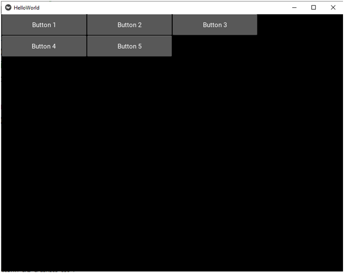
So, as you can see we indeed have two rows. The GridLayout is smart enough to know how many items to put in the first row before starting the second row. I numbered the buttons on purpose. You can now easily see what order the buttons were added in: first row 1 from left to right, then row 2 from left to right, for as long as there are any widgets left.
And now I’m going to achieve the same effect using the cols property. Let’s rewrite the kv code so that we set the number of columns to 3. Here’s the kv code:
# File name: helloworld.kv

<Button>:
    size_hint: None, None
    size: 200, 50

<GridLayout>:
    # We need three columns now.
    cols: 3

    Button:
        text: 'Button 1'

    Button:
        text: 'Button 2'

    Button:
        text: 'Button 3'

    Button:
        text: 'Button 4'

    Button:
        text: 'Button 5'
And here’s what we get when we run the program:

See any difference? Well, in this particular case there isn’t any. This is just how it works. The widgets are added from left to right, row after row. So, what if you set the number of columns to two? Let’s find out:
# File name: helloworld.kv

<Button>:
    size_hint: None, None
    size: 200, 50

<GridLayout>:
    # We need two columns now.
    cols: 2

    Button:
        text: 'Button 1'

    Button:
        text: 'Button 2'

    Button:
        text: 'Button 3'

    Button:
        text: 'Button 4'

    Button:
text: 'Button 5' 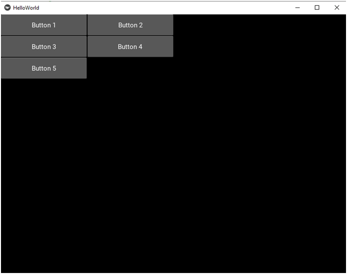
But still, you can see that the order of adding them is again row by row, from left to right. OK, there is much more to the GridLayout, but we’ll be talking about some other Grid-related stuff when we need it later in our project. For now, let’s move on to the next layout.
The BoxLayout is a very common layout and we’ll be making use of it a lot in our project. You can imagine it as a GridLayout with just one row or one column. If you want all the elements to be positioned in one row, you should set the orientation property to ‘horizontal’, or just leave it out altogether as this is the default value. If you want the elements to be in a column, you should set orientation to ‘vertical’. Let’s see how it works. Here’s the Python file:
import kivy
from kivy.app import App

# We must import the BoxLayout class.
from kivy.uix.boxlayout import BoxLayout

class HelloWorldApp(App):
    def build(self):
        # We're going to use the BoxLayout now.
        return BoxLayout()

if __name__ == '__main__':
HelloWorldApp().run()# File name: helloworld.kv
<Button>:
size_hint: None, None
# Let's make the buttons slightly shorter so that they all
# fit in one row.
size: 100, 50
<BoxLayout>:
# The buttons should be in a row.
orientation: 'horizontal' # this is the optional default value
Button:
text: 'Button 1'
Button:
text: 'Button 2'
Button:
text: 'Button 3'
Button:
text: 'Button 4'
Button:
text: 'Button 5' 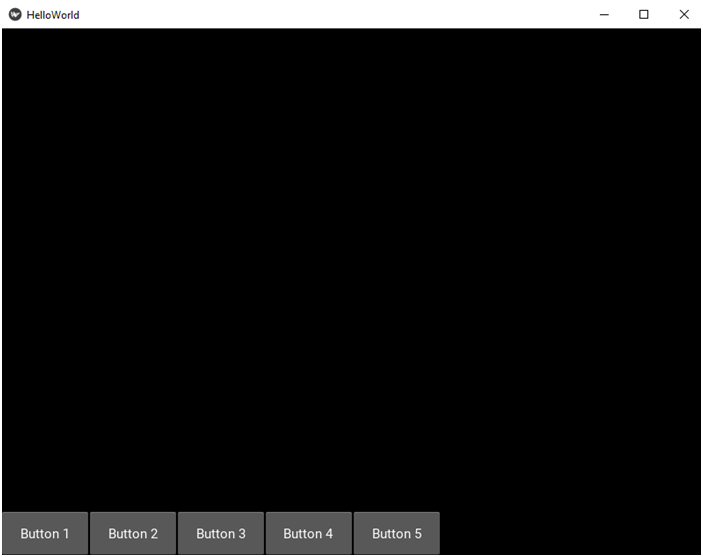
And now let’s put the buttons in a column:
# File name: helloworld.kv

<Button>:
    size_hint: None, None

    # Let's make the buttons slightly shorter so that they all
    # fit in one row.
    size: 100, 50

<BoxLayout>:
    # The buttons should be in a column.
    orientation: 'vertical'

    Button:
        text: 'Button 1'

    Button:
        text: 'Button 2'

    Button:
        text: 'Button 3'

    Button:
        text: 'Button 4'

    Button:
        text: 'Button 5'
Here’s the app when you run it: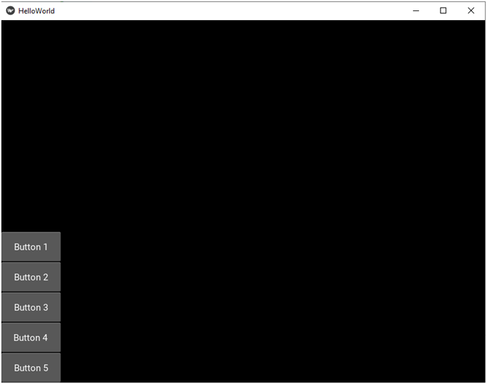
The next layout we’re going to talk about is the StackLayout. Let’s start with the Python code as usual:
import kivy
from kivy.app import App

# We must import the StackLayout class.
from kivy.uix.stacklayout import StackLayout

class HelloWorldApp(App):
    def build(self):
        # We're going to use the StackLayout now.
        return StackLayout()

if __name__ == '__main__':
    HelloWorldApp().run()
Just like the BoxLayout, the StackLayout also has the orientation property, but it works in a different way. This layout arranges the widgets in a specific order and automatically moves on to the next row or column when it run out of space in the current row or column. The orientation property takes one of the following values:
rl-tb : right to left, top to bottom
lr-tb : left to right, top to bottom
rl-bt : right to left, bottom to top
lr-bt : left to right, bottom to top
Let’s try the out. Here’s the kv code:
# File name: helloworld.kv

<Button>:
    size_hint: None, None

    # Let's make the buttons slightly bigger.
    size: 300, 200

<StackLayout>:
    # The buttons should be arranged from right to left, top to bottom.
    orientation: 'rl-tb'

    Button:
        text: 'Button 1'

    Button:
        text: 'Button 2'

    Button:
        text: 'Button 3'

    Button:
        text: 'Button 4'

    Button:
        text: 'Button 5'
Here’s the app window. Watch what order the buttons appear in: first right to left and then top to bottom.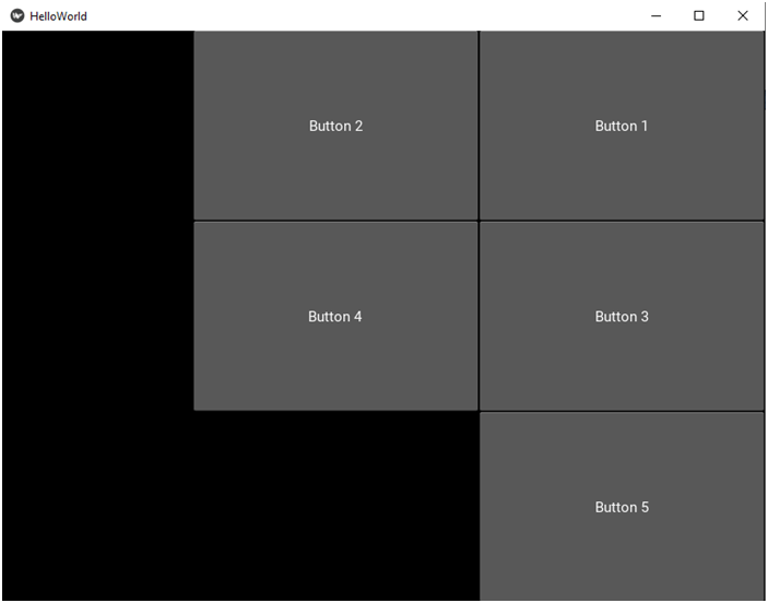
 # File name: helloworld.kv

<Button>:
    size_hint: None, None
    size: 300, 200

<StackLayout>:
    # The buttons should be arranged from left to right, top to bottom.
    orientation: 'lr-tb'

    Button:
        text: 'Button 1'

    Button:
        text: 'Button 2'

    Button:
        text: 'Button 3'

    Button:
        text: 'Button 4'

    Button:
text: 'Button 5' 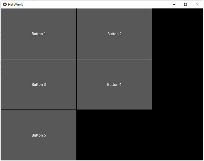
And now right to left, bottom to top:
 # File name: helloworld.kv

<Button>:
    size_hint: None, None
    size: 300, 200

<StackLayout>:
    # The buttons should be arranged from right to left, bottom to top.
    orientation: 'rl-bt'

    Button:
        text: 'Button 1'

    Button:
        text: 'Button 2'

    Button:
        text: 'Button 3'

    Button:
        text: 'Button 4'

    Button:
text: 'Button 5' 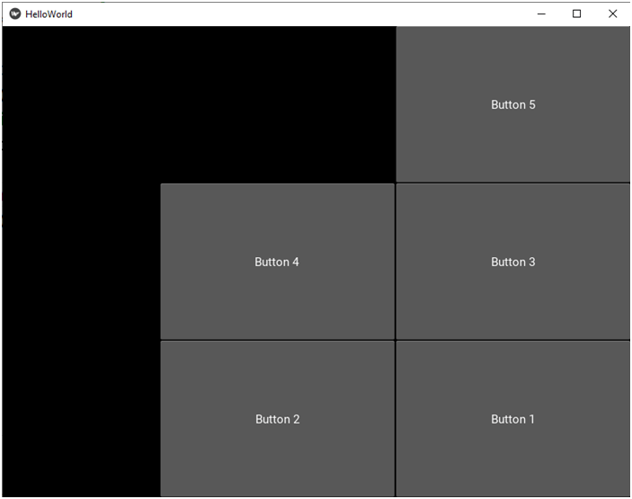
Finally, left to right, bottom to top:
 # File name: helloworld.kv

<Button>:
    size_hint: None, None
    size: 300, 200

<StackLayout>:
    # The buttons should be arranged from left to right, bottom to top.
    orientation: 'lr-bt'

    Button:
        text: 'Button 1'

    Button:
        text: 'Button 2'

    Button:
        text: 'Button 3'

    Button:
        text: 'Button 4'

    Button:
text: 'Button 5' 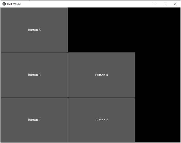
import kivy
from kivy.app import App

# We must import the AnchorLayout class.
from kivy.uix.anchorlayout import AnchorLayout

class HelloWorldApp(App):
    def build(self):
        # We're going to use the AnchorLayout now.
        return AnchorLayout()

if __name__ == '__main__':
HelloWorldApp().run()# File name: helloworld.kv
<Button>:
size_hint: None, None
# Let's make the button smaller again.
size: 100, 50
<AnchorLayout>:
# Let's position the button in the upper right corner.
anchor_x: 'right'
anchor_y: 'top'
Button:
text: 'Button'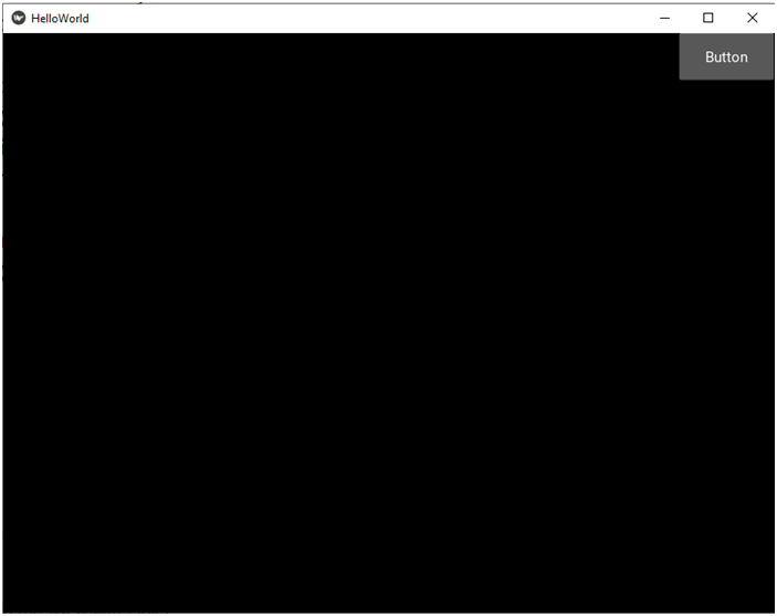
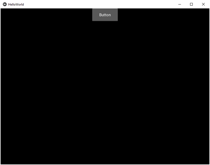
Well, I added just one button here because otherwise the buttons would be on top of one another and only the last one would be visible unless we changed the sizes of some of them. This layout is more practical if you want to position a custom widget, or even more if you want to position another embedded layout. For example you can imagine making a menu consisting of 5 labels positioned in a row inside a BoxLayout and then positioning the whole menu inside the AnchorLayout. We’re going to see some embedding examples in the next part. And now some more examples with the AnchorLayout. Only the kv file is going to change. Here’s the first example. We want to position the button in the center (horizontally) and at the top:
# File name: helloworld.kv

<Button>:
    size_hint: None, None

    # Let's make the button smaller again.
    size: 100, 50

<AnchorLayout>:
    # Let's position the button in top central position.
    anchor_x: 'center'
    anchor_y: 'top'

    Button:
        text: 'Button'
# File name: helloworld.kv

<Button>:
    size_hint: None, None

    # Let's make the button smaller again.
    size: 100, 50

<AnchorLayout>:
    # Let's position the button in lower left corner.
    anchor_x: 'left'
    anchor_y: 'bottom'

    Button:
        text: 'Button'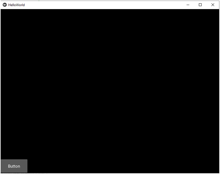
# File name: helloworld.kv

<Button>:
    size_hint: None, None

    # Let's make the button smaller again.
    size: 100, 50

<AnchorLayout>:
    # Let's position the button in lower left corner.
    anchor_x: 'center'
    anchor_y: 'center'

    Button:
        text: 'Button'