
Float Layout
What we are going to do now is write code that uses a FloatLayout with a text input and a custom button in it. To demonstrate how the properties used for sizing and positioning work, though, let’s use just the button first.
This time we’re going to use the size_hint property instead of size to set the widget size.
Suppose the button should occupy 30% of the window in horizontal direction and 10% in vertical direction. These percentages should be expressed as .3 and .1 respectively.
We’re also going to use the pos_hint property instead of pos. The pos_hint property must be assigned a dictionary
with the x, right, y and top values specified. Naturally only up to two of them should be specified at any given time:
x or right for the horizontal position and y or top for the vertical position.
What are the four properties?
x – the left border of the widget
right – the right border of the widget
y – the bottom border of the widget
top – the top border of the widget
The values for each of the properties above is in the range from 0 to 1.
For example, if x is set to 0, it means the left border, if it’s set to 1, it means the right border and if it’s set to .3, it’s 30% into the window from the left border. The other properties work the same.
To make it clearer, let’s use different combinations of the size_hint and pos_hint properties. If you run the program after each change, you will quickly see how they work.
The content of the FloatLayout will be defined in the kv file, so in the Python file we’re only going to return a FloatLayout without bothering what there is in it. This is why the Python file will be the same for each of the examples below. What is going to change is the kv file. So, the Python file is here:
| |
Let’s start with some basic examples. In the first couple examples we’re not going to bother with position, we’re only going to set the widget size. This means the default position will be assigned, which is the lower left corner.
Here’s the first kv snippet:
# File name: helloworld.kv

# Here's our FloatLayout class
<FloatLayout>:
    Button:
        text: 'Press Me'

        # The button should occupy 50% of the window in both horizontal
        # and vertical direction.
        size_hint: .5, .5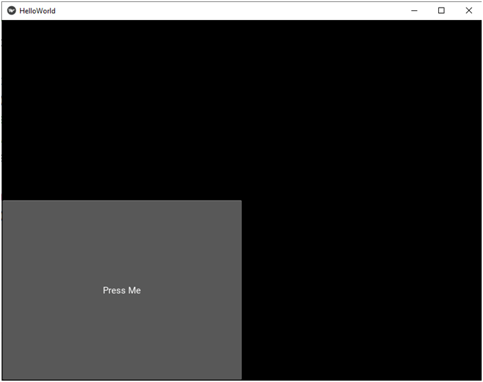
Notice that even if you resize the window, the button will still occupy 50% of it in each direction: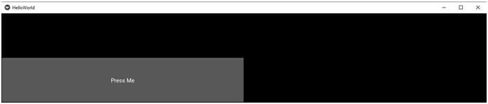
# File name: helloworld.kv

<FloatLayout>:
    Button:
        text: 'Press Me'

        # The button should occupy 100% of the window in horizontal
        # direction and 30% in vertical direction.
        size_hint: 1, .3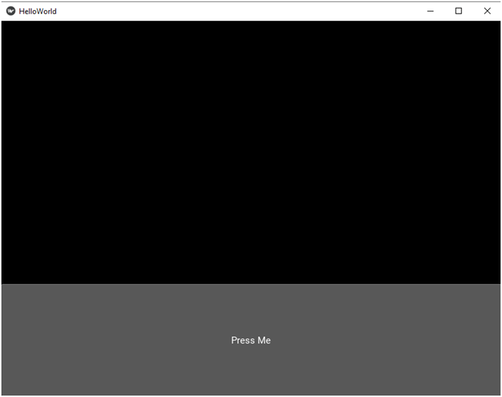
Finally let’s make the button fill the whole window. Actually it will fill the whole FloatLayout, which itself fills the whole window. Here’s the code:
# File name: helloworld.kv

<FloatLayout>:
    Button:
        text: 'Press Me'

        # The button should occupy 100% of the window in both directions.
        size_hint: 1, 1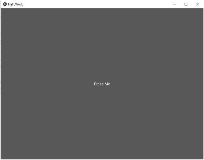
The size_hint property is set to a tuple of two values, one for scaling in horizontal and the other in vertical direction. But sometimes you may want to scale a widget in just one direction. Then you can use the size_hint_x or size_hint_y property, depending on which direction you need. Let’s scale the button only in horizontal direction first:
# File name: helloworld.kv

<FloatLayout>:
    Button:
        text: 'Press Me'

        # Scale the button only in horizontal direction. It should always
        # occupy 80% of the width of the window.
        size_hint_x: .8
And here’s how it looks: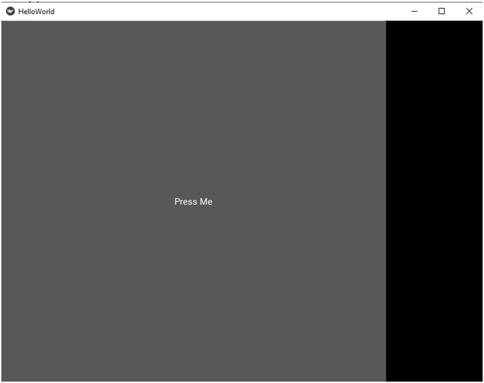
And now let’s scale it only in vertical direction:
# File name: helloworld.kv

<FloatLayout>:
    Button:
        text: 'Press Me'

        # Scale the button only in vertical direction. It should always
        # occupy 15% of the height of the window.
        size_hint_y: .15
Here’s the app running: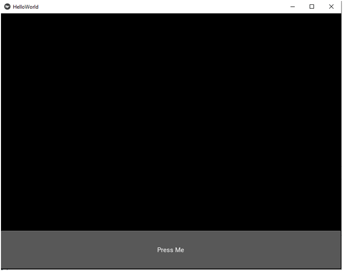
Now that you know how to scale the widget, let’s experiment with its position. As you know, the default position is at the coordinates 0, 0, which is at the lower left corner. Now let’s try out all the four properties that we listed before: x, right, y and top. We’re even going to learn two more properties in a minute.
Let’s start with horizontal positioning. Vertical positioning works pretty much the same, as you will see a bit later.
Anyway, let’s modify our kv file so that there are three buttons. We want each button to have the same size, so we can define a custom button. Here’s the code with x set to 0, .5 and 1. Remember that x is the left border of the widget, so the left border of the button in our case. If you don’t set either the y or the top property, vertical position will default to y = 0.
# File name: helloworld.kv
<CustomButton@Button>:
    # We want each button to occupy 20% in horizontal direction
    # and 10% in vertical direction.
    size_hint: .2, .1

<FloatLayout>:
    CustomButton:
        text: 'Button 1'

        # left border of the button on the left
        pos_hint: {'x': 0}
    CustomButton:
        text: 'Button 2'

        # left border of the button in the middle of the width of the container
        pos_hint: {'x': .5}
    CustomButton:
        text: 'Button 3'

        # left border of the button on the right border of the container
        pos_hint: {'x': 1}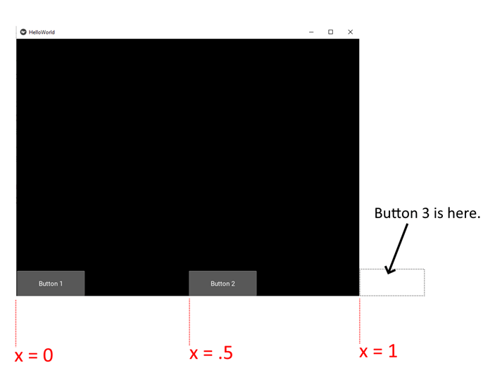
If you set x to a value outside the range from 0 to 1, the button or part of it will be outside the window. By setting it to a negative value, the button will be moved to the left. If you set it to a number greater than 1, it will be moved to the right. Finally, by setting it to a number close to 1, the right part of the button will be outside the window, etc. Have a look:
# File name: helloworld.kv
<CustomButton@Button>:
    size_hint: .2, .1

<FloatLayout>:
    CustomButton:
        text: 'Button 1'

        # the whole button outside the window on the left
        pos_hint: {'x': -2}
    CustomButton:
        text: 'Button 2'

        # left part of the button outside the window on the left
        pos_hint: {'x': -.1}
    CustomButton:
        text: 'Button 3'

        # right part of the button outside the window on the right
        pos_hint: {'x': .9}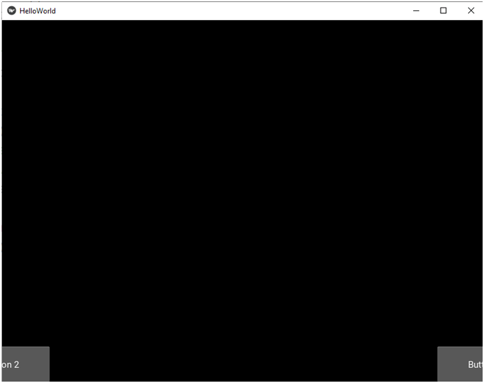
Now, suppose we want the buttons to be positioned uniformly: Button 1 on the left, Button 2 in the middle and Button 3 on the right. This would be difficult to achieve with just the x property, because you would have to take into consideration the width of the button to calculate the position of its center and right border. This is where two other properties come in handy: the aforementioned right property for the right border of the widget and the center_x property for the center of the widget in horizontal direction. Let’s see how we can use them:
# File name: helloworld.kv
<CustomButton@Button>:
    size_hint: .2, .1

<FloatLayout>:
    CustomButton:
        text: 'Button 1'

        # This button should be on the left.
        pos_hint: {'x': 0}
    CustomButton:
        text: 'Button 2'

        # This button should be in the middle, so let's use the center_x property.
        pos_hint: {'center_x': .5}
    CustomButton:
        text: 'Button 3'

        # This button should be on the right, so let's use the right property.
        pos_hint: {'right': 1}
Here’s the app when you run it: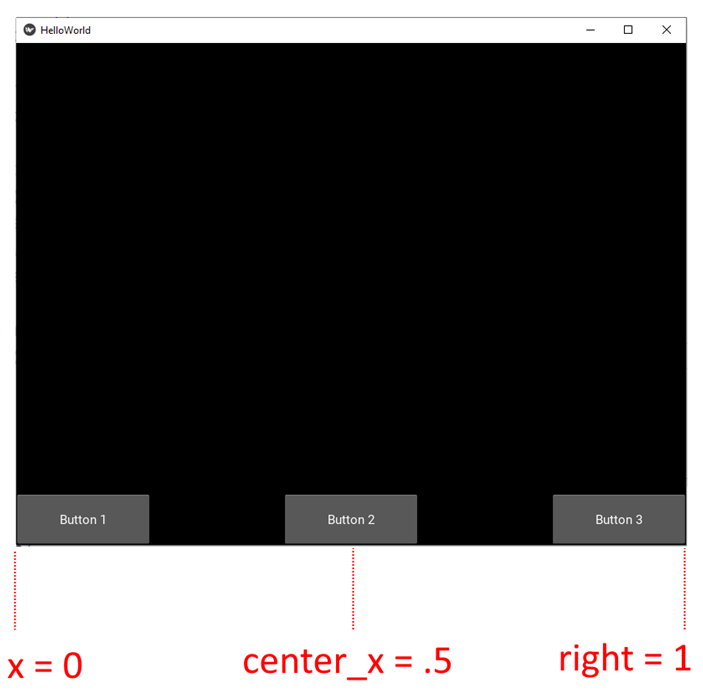
And just one more example with the center_x and right properties in action:
# File name: helloworld.kv
<CustomButton@Button>:
    size_hint: .2, .1

<FloatLayout>:
    CustomButton:
        text: 'Button 1'

        # The right border of this button should be near the left
        # border of the window. Part of the button will be invisible.
        pos_hint: {'right': .1}
    CustomButton:
        text: 'Button 2'

        # The right border of this button should be at the center of the window.
        pos_hint: {'right': .5}
    CustomButton:
        text: 'Button 3'

        # The center of this button should be 75% away from the left border
        # of the window.
        pos_hint: {'center_x': .75}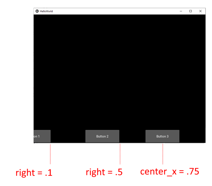
Now that you understand how the three properties x, center_x and right work, it will be easier to understand how their counterparts in the vertical direction work. These are y, center_y and top. In the following examples we can omit the x, center_x and right properties in the pos_hint dictionary. Then the button will be placed at x = 0, which is the default. Have a look: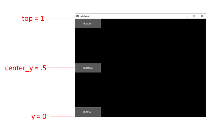
Naturally, you can position widgets in both directions at the same time. Then you just have to set two properties in the pos_hint dictionary. here’s an example:
# File name: helloworld.kv
<CustomButton@Button>:
    size_hint: .2, .1

<FloatLayout>:
    CustomButton:
        text: 'Button 1'

        # The button should be 10% from the left horizontally
        # and its top should be in the middle vertically.
        pos_hint: {'x': .1, 'top': .5}
    CustomButton:
        text: 'Button 2'

        # The button should be in the center of the window.
        pos_hint: {'center_x': .5, 'center_y': .5}
    CustomButton:
        text: 'Button 3'

        # The button should be on the right and 20% above the bottom.
        pos_hint: {'right': 1, 'y': .2}
And this is what we get: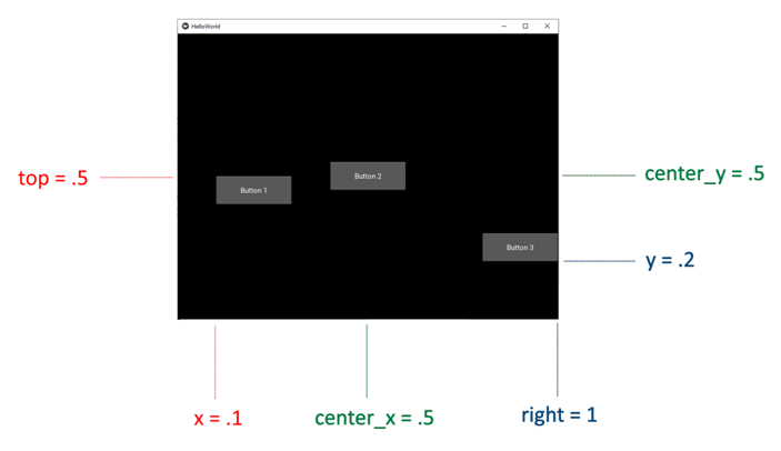
Well, these are the basics of scaling and positioning widgets in layouts. But there’s more to it. You can also use the size and pos properties in layouts. In the next part we’ll have a look at some more advanced examples of scaling and positioning widgets in layouts.