
3. Label Properties
Taken from prosperocoder.com
Here’s the code again.
The Python file:
| |
and the kv file:
| |
This program displays a label. The label has a text property. This is a special Kivy property, not to be confused with the regular Python property. We’re going to use Kivy properties a lot, and even create our own ones, just bear with me. Anyway, the Label class has some more properties. We’re going to have a look at the Label properties in this part and then in the next part we’ll see how to use other widgets like buttons, toggle buttons, check boxes, text inputs and sliders, both in Python and in the Kivy language. These are the widgets we’ll be making use of in our project, but there many others, which you can look up in the documentation, which you can find at kivy.org.
And now let’s have a closer look at the Label class and the Label properties. You already know the text property. It’s used to set the actual text you want to display. By the way, you probably noticed that the name of a property is followed by a colon and then comes the value we want to set the property to. This same syntax is valid for all the other properties.
The next property I’d like to mention is font_size. The name is pretty self-explanatory, let me just add that the value is in pixels. Let’s add this property to the code in our helloworld.kv file:
| |
Other Label Properties – The color Property There’s another property for the color of the text, called color to make things more interesting. What is really interesting about this property, however, is its value, which is a list with four elements: r(ed), g(reen), b(lue) and a(lpha). The default value is [1, 1, 1, 1], which corresponds to fully opaque white. The values for each component are in the range from 0 to 1, which probably is not exactly what you are used to. In a lot of frameworks the values of r, g, b and a are from 0 to 255. Here, it is your task to recalculate the values so that they fit in the 0-1 range. Just keep in mind that 0 is the same in both ranges and 255 in the traditional scale corresponds to 1 in kv. So, if you want the color to be a shade of purple where the values are:
r = 126
g = 45
b = 210
a = 255
you can either calculate the kv values manually like so:
r = 126/255 ≈ 0.56
g = 45/255 ≈ 0.18
b = 210/255 ≈ 0.82
a = 255/255 = 1
or type the operations directly in the list. So, in our case you could set the color like so:
color: [.56, .18, .82, 1]color: [126/255, 45/255, 210/255, 1]<Label>:
text: 'Hello World!'
font_size: 50
color: [126/255, 45/255, 210/255, 1]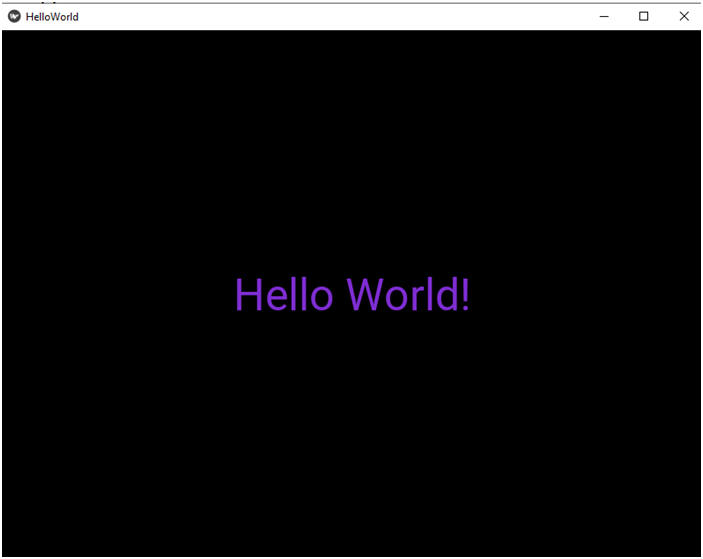
Font size
There are lots of other properties that you can use with the Label class. Some of them will be used in the project and I’ll talk a little more about them when you need them. There is however one very interesting property that we are not going to use in the app, and which is definitely worth mentioning, that’s why I’d like to tell you something about it now.
You can style your text using text markup. This is very similar to what you may be familiar with if you know some HTML, however instead of angled brackets (<>, </>) we use square brackets in kv ([ ], [/]). Just like in HTML there’s an opening tag and a closing tag, as you can see.
There are lots of tags available. Let’s have a look at just a small selection:
[b][/b] – bold text
[i][/i] – italic text
[u][/u] – underlined text
[s][/s] – strikethrough text
[sub][/sub] – subscript text
[sup][/sup] – superscript text
[size=
[color=#
In order to use text markup, you must add one more property, markup, and set it to True. Let’s now change the text to something longer than Hello World and try the markup tags out. Here’s the code:
<Label>:
    text: 'normal [b]bold[/b] [i]italic[/i] \n[u]underlined[/u] [s]strikethrough[/s] \n[sub]subscript[/sub] [sup]superscript[/sup] [size=100]big[/size] [color=#ff0f]yellow[/color]'
    font_size: 50
    color: [126/255, 45/255, 210/255, 1]
markup: TrueFirst, the value of the text property, which is the string, should be all on a single line.
Second, in text markup we use hex values for colors, so if the rgba for yellow is 255, 255, 0, 255 (fully opaque), then its hexadecimal representation is ff0f, which you can see in the color tag.
Now run the program and you should get something like this: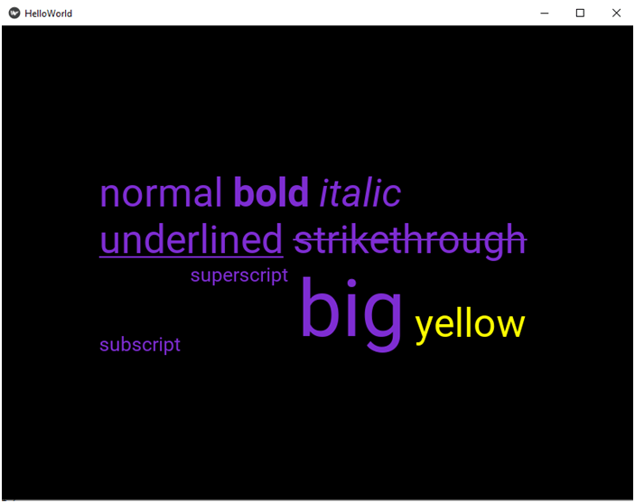
Font size