
More Widgets
Taken from prosperocoder.com
Let’s start with the check box Kivy widget. The check box is a two-state button that can be either checked or unchecked. Later we’ll see that it can be used as a radio button as well, if it’s in a group, but for now let’s just have a look at a single check box.
The main property of a check box is active, which is True if it’s checked and False otherwise. The basic check box event is on_active, which is fired if the state of the checkbox changes.
Let’s replace our button from the previous part with a check box. Here are the two files, main.py and helloworld.kv with comments. Here’s the Python file:
| |
and the kv file:
| |
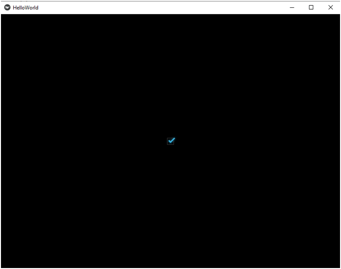
If you run the main.py file, you will see a checked box in the app window. You can now uncheck it and check it again to see how it works.
Font size
Let’s make the check box do something when its state changes. For now something as simple as printing out a message in the terminal will do. Here’s the kv file:
| |
Font size
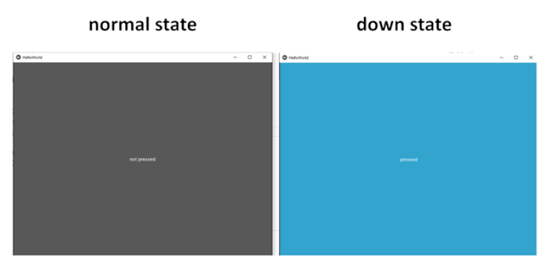
The next widget I’d like to discuss is the toggle button, which shares features with both the regular button and the check box. It looks like a button at first glance, but when you press it, it remains pressed, just like the check box remains checked when you check it. So, it’s a two-state button as well. The two states are normal and down.
You can set the state of the button to normal or down using the state property. You can use the on_state event if something should happen when the state changes. Besides, you can use the text property as you did with the regular button.
Also, just like check boxes, toggle buttons may be grouped so that only one toggle button may be in the down state (i.e. pressed) at a time in a group. But this is beyond the scope of this introductory article.
Creating and using a toggle button is easy. Let’s remove the code responsible for the check box we just created and let’s add a toggle button. Here is the Python file with comments:
| |
| |
Font size
The next widget I’d like to briefly discuss is the text input. There’s much more I could write about this widget than about all the other widgets so far. However, I’m not going to do that, at least not just yet. The text input widget is going to be used later in our project, so I will discuss all the properties and events that we need in due time. For now let me just concentrate on the very basics.
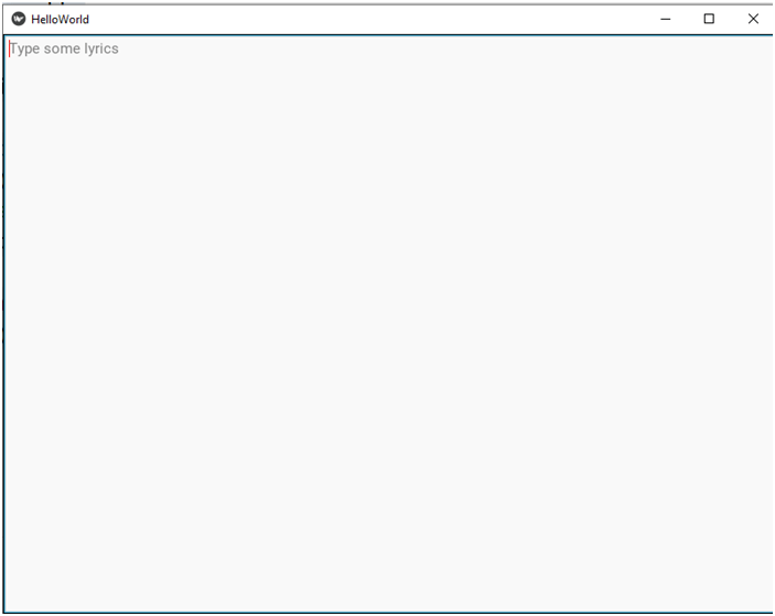
So, a text input is a widget in which the user can enter text. Then our program can use this text in one way or another, depending on what we need. The text input widget may allow multiline text or just a single line of text. If you need the latter, just set the multiline property to False. The text property is used for the text in the text input widget, and there may also be a hint text, which is visible when the widget contains no text. This is usually used as a prompt as to what sort of data is expected in the widget. To set the hint text you use the hint_text property.
There are tons of other properties, which I’m not going to discuss now. There are also tons of events, which you can use if some text is entered, when it’s validated, when the widget gets focus, and so on.
OK, let’s have a look at a simple example with a multiline text input first. Here’s the Python code:
# File name: main.py

import kivy
from kivy.app import App

# This is what you need to import in order to use a text input.
from kivy.uix.textinput import TextInput

class HelloWorldApp(App):
    def build(self):
        # Now we want a text input to be returned.
        return TextInput()

if __name__ == '__main__':
HelloWorldApp().run()# File name: helloworld.kv
# Now we're using the TextInput class
<TextInput>:
# Let's set the text property to 'hello'.
text: 'hello darkness, \nmy old \nfriend...'
# The multiline property is by default set to True, so this line of code is redundant.
multiline: True
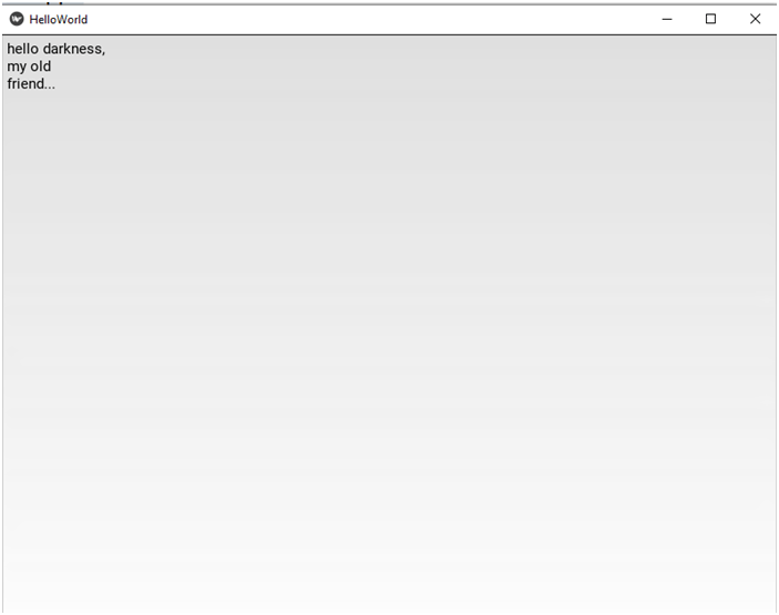
hint_text: 'Type some lyrics'In the kv file we set the value of the text property to a multiline string. As you can see, you can use the newline escape sequence inside your string. This is what you get:
Font size
Font size
And now suppose we want to only allow single line text. All you have to do is set the multiline property to False:
# File name: helloworld.kv

# Now we're using the TextInput class
<TextInput>:
    # Remove the newline characters because this is going
    # to be single line text.
    text: 'hello darkness, my old friend...'
    multiline: False
    hint_text: 'Type some lyrics'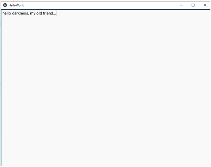
Font size
There’s much more to text inputs than that, but let me now move on to the last widget I’d like to introduce in this article, the slider.
The slider looks like a scrollbar. You can use it to set a value between a minimum and a maximum value. The main properties of a slider are min, max and value, which you can use to set the just mentioned values. The min and max properties are self-explanatory. The value property is the default value.
Besides, sliders may be oriented horizontally (by default) or vertically, depending on what you set the orientation property to.
So, this is enough for us to know to create a simple slider. Let it be a horizontal slider with values between -100 and 200 and with the default value of 0. Here’s the Python file:
# File name: main.py

import kivy
from kivy.app import App

# This is what you need to import in order to use a slider.
from kivy.uix.slider import Slider

class HelloWorldApp(App):
    def build(self):
        # Now we want a slider to be returned.
        return Slider()

if __name__ == '__main__':
HelloWorldApp().run() | |
Now run the program. You will see the slider occupy the whole window. It’s set to the default value of 0, but you can slide it to the left and to the right. Give it a try.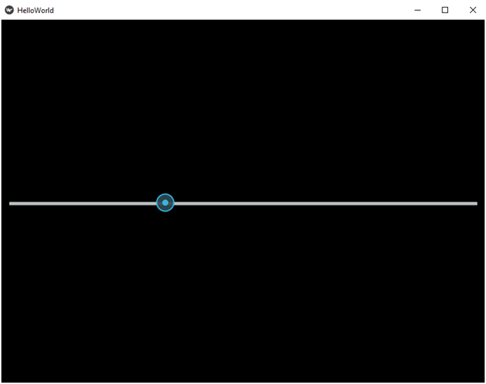
Font size
vertical orientation And now change the orientation to vertical and run the program again. Here’s the kv file:
| |